Project Verano
I spy a bubble!
Github: ProjectVerano
Partners: Sean Stockwell
Last summer, I asked my friend Sean if he'd like to work on a project with me. I was planning on doing something related to finance, so I started by just making the layout for an app that tracked the S&P 500 index over the years and plotted the results on a simple D3 line graph. Adding a little bit of CSS fanciness, I got a working product:
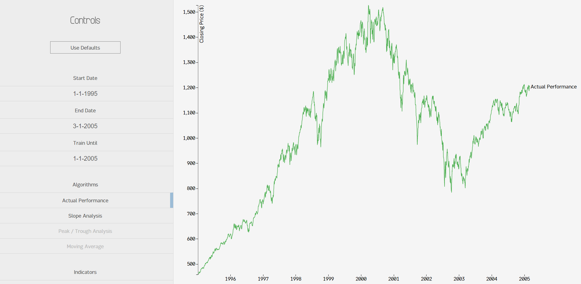
Not bad. So then, what did this become? Well, I had planned to eventually use predictive techniques (including machine learning) to do some price forecasting, but summer is too short for anything we ever want to do. Instead, I made it into a barebones analysis app. Sean and I developed a few algorithms to look for extrema and volatility regions. Actually, that was his job. I mostly screwed around with D3. I learned quite a bit about data presentation, though, which was fun!
Features
There wasn't too much to the application. We ended up finishing the graph, extrema indicators, and volatility regions. Here's a look at what a side-by-side analysis would look like:
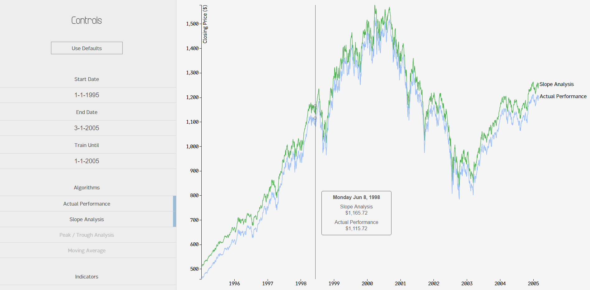
For some reason, getting multiple lines to show up on the graph was unintuitive. In that screenshot you can also see the tooltip that followed your mouse and displayed the price for each algorithm.
Let's take a look at the extrema markers. We implemented absolute minima and maxima markers (easy) and then Sean developed an algorithm that grabbed local minima and maxima (hard). Here's a screenshot of all of the extrema on the same page on a shorter timeframe:
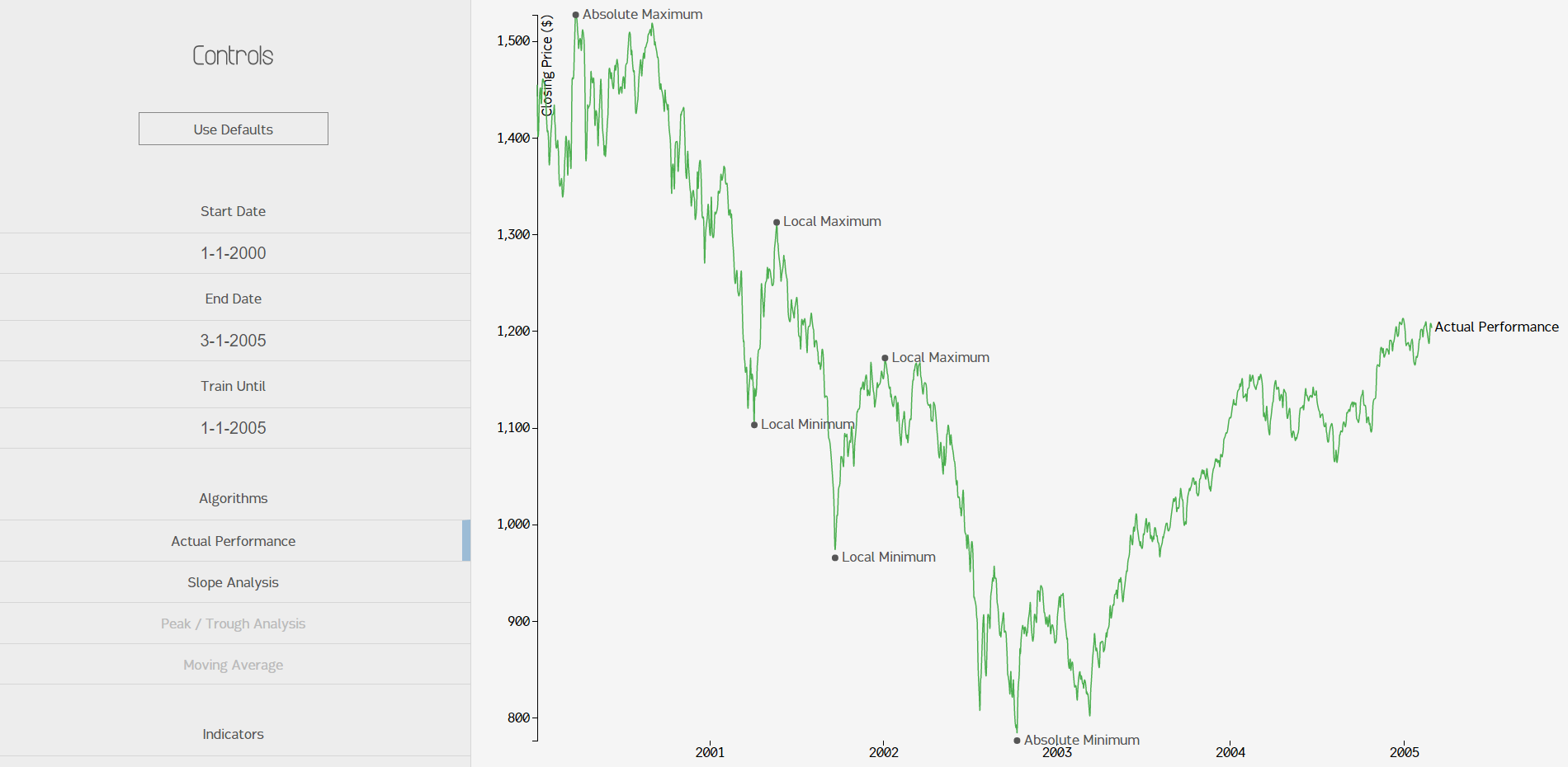
You can see the code below, but it's a custom implementation that uses a threshold variable to analyze a certain timeframe within each list of prices and a kind of sliding window algorithm to look for abrupt price changes.
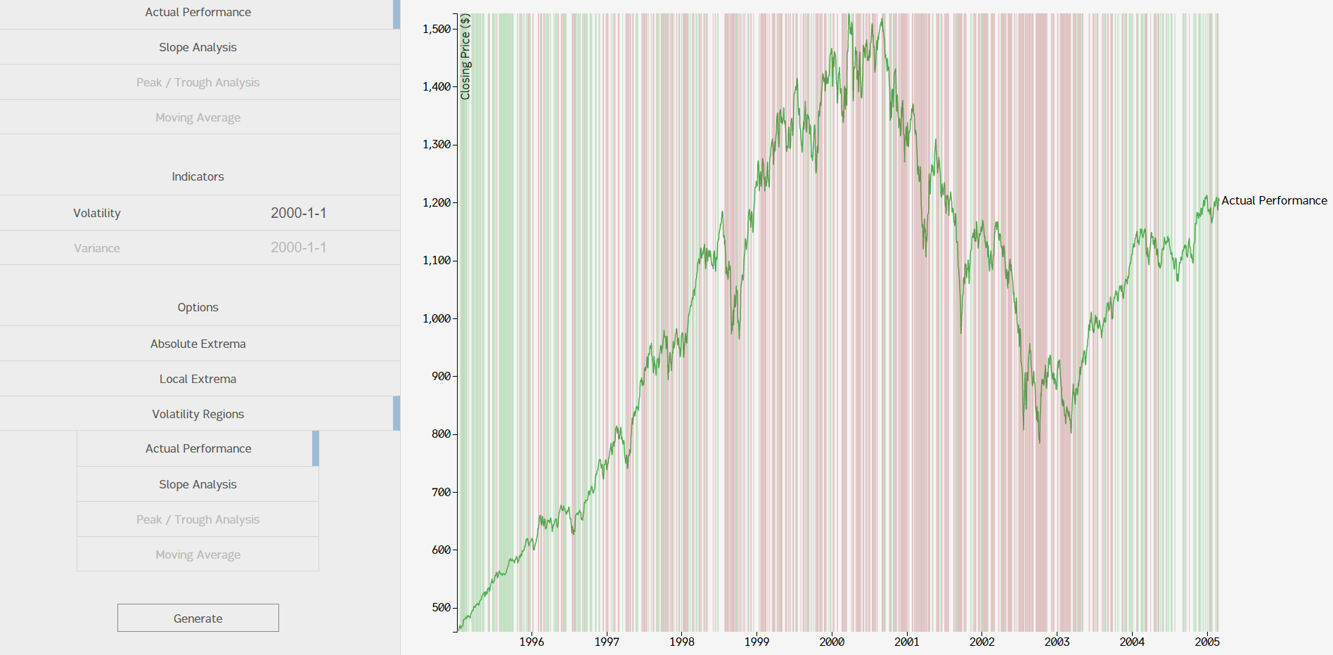
Volatility regions worked in a similar manner, except they measured relative volatility instead of extrema. We decided to display the regions as either low volatility (green), no volatility (no color), or high volatility (red). Here's what it would look like in a relatively short timeframe:
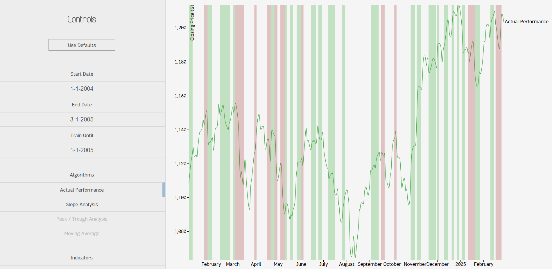
You can see off the image that the algorithm produced a few interesting side effects, which I will claim were all absolutely intended. You might notice that, in general, red regions (low volatility) are placed when the market price is going in one direction with only slight hiccups. Green regions (high volatility) nearly always involve regions with bumps or hiccups in the price. It makes sense that there's more green than red, since the stock market is a mess of ups and downs; certainty in the free market is coupled almost exclusively with avaritia and fear. Since this model looks like it makes sense, I'll assume its wrong and file it with my other marginal failures.
Implementation
There were only a few moving parts in the project. I'll go into a bit of detail about the algorithms, but I can't guarantee too much on the motivations of each.
The tech stack was fairly simple. I used Python again. Django was too heavy for a one-page app, so I went with Flask. Flask is lightweight and very quick to set up, making it great for mini-projects like this. Everything was computed on-demand, so there was no need for a database. I didn't manage to find a Python package I particularly liked for getting the financial data, so I just downloaded a big CSV from Yahoo! Finance and used Python's CSV reader package to load it. The performance wasn't bad at all, so I decided to keep it that way.
Finding the absolute extrema was easy; I just did a linear search and found the minimum / maximum. Done. The local extrema were harder. Here's the code, with an explanation on top:
# The following function allows the user to choose a tolerance for which to validate weather a peak or trough
			# is actually a local min or max. To test a point's validity, we establish two boundares:
			#
			#     Boundary 1 is placed before the local min or max. It will usually be the local min / max, or the starting point.
			#     The next local min/max must drop below or exceed this boundary by the tolerance to become a potential local max or min.
			#     At this point, we continue to move along the graph.
			#
			#     Boundary 2 is then set equal to the new local max or min candidate. This boundary changes as we test different points.
			#     Once it is below or above our established local max or min by the given tolerance, the function then adds the stored
			#     local max/min to its respective list, the boundaries are reset, and the process starts over.

			def loc_min_max(data, algo_code, tolerance):
				# all_data = gd.get_hist_sp(start_date, end_date)
				#print all_data

				# Creates a boundary point to base local mins and maxes off of
				# Boundary 1 is before local min/max, boundary 2 is after
				bound1 = data[0]
				bound2 = bound1
				# Creates empty lists that will contain the date-price dictionaries of local maxes and mins, respectively
				lmax = []
				lmin = []
				# Variables that temporarily store potential local maxes or mins
				local_max = bound1
				local_min = bound1
				for dct in data:
					if dct[algo_code] > local_max[algo_code]:
						local_max = dct
					elif local_max[algo_code] - bound1[algo_code] > tolerance:
						bound2 = dct
						if local_max[algo_code] - bound2[algo_code] > tolerance:
							lmax.append(local_max)
							bound1 = local_max
							local_min = bound2
							local_max = local_min
					elif dct[algo_code] < local_min[algo_code]:
						local_min = dct
					elif bound1[algo_code] - local_min[algo_code] > tolerance:
						bound2 = dct
						if bound2[algo_code] - local_min[algo_code] > tolerance:
							lmin.append(local_min)
							bound1 = local_min
							local_min = bound2
							local_max = local_min

				return [lmin, lmax]
The boundaries are set on the first price at initialization, then boundary 2 is moved around to potential extrema based on the threshold, then the local min / max is checked against the boundaries to see if the price differential passed the threshold. It's a pretty clever technique.
Volatility was kind of the same deal, but less cryptic. I like this implementation a lot, since it's easy to quantify the volatility. In our implementation, we measured it by finding regions where the price differed day-by-day by .5% or more for each day in the timeframe. Here's the code:
# Essentially, this function looks to see if the index differs by more than 0.5% from the previous day's price (this percentage could
			# obviously be adjusted). When it does differ by more than the set percentage, we consider it to have high volatility. We record
			# it as one day of high volatility, hence the i and j's. If we get to 3 days in a row of this behavior, the program is written so
			# that the next time it doesn't differ by the set percentage (low volatility), then the start_date and previous_date are recorded
			# as the date range of high volatility. The start_date is then reset and the procedure starts over. It works the same for consecutive
			# days of low volatility.

			def low_high_vol(all_data, algo_code):

				low_vol = [] # TODO: List of lists - ...that holds what?
				high_vol = [] # TODO: List of lists - ...that holds what?
				temp_low = [] # Temporary list that will hold high volatility start and end dates
				temp_high = [] # Temporary list that will hold low volatility start and end dates
				undeter = [] # TODO: Dates where low volatility or high volatility doesn't persist for minimum of 3 days - This is unused?

				# Will be used as start date for range, previous date will be used to test for volatility day by day
				start_date = all_data[0]
				previous_date = all_data[0]

				# Tallies for keeping track of days in a row (remember, must get to 3)
				i = 0 # Low volatility
				j = 0 # High volatility

				for dct in all_data:

					# Difference in index value from one day to the next
					diff = dct[algo_code] - previous_date[algo_code]
					# Tolerance: volaility is a change of more than .5% from the previous day
					# TODO: >1% daily change may indicate high volatility, but what indicates low volatility? There's no differentiation here.
					#     I would also suggest allowing the user to define the threshold or have it dynamically calculated somehow. Magic numbers are bad.
					# tol = previous_date[algo_code] * .005
					tol = previous_date[algo_code] * .005

					# High volatility
					if abs(diff) > tol:
						j = j + 1
						if i > 0:
							if i > 2:
								temp_low.append(start_date["date"])
								temp_low.append(dct["date"])
								low_vol.append(temp_low)
								temp_low = []
							i = 0
							start_date = dct
					# TODO: This could be either low volatility or undetermined - rework to differentiate
					else:
						i = i + 1

						if j > 0:

							if j > 2:
								temp_high.append(start_date["date"])
								temp_high.append(dct["date"])
								high_vol.append(temp_high)
								temp_high = []

							j = 0
							start_date = dct

					previous_date = dct

				return low_vol, high_vol
I really liked this approach, but I wanted to see if I could "smoothen" the regions when the timeframe was larger. The motivation for that comes out of this image:
Problem: when the timeframe is large, this method of finding volatility regions isn't very helpful. A naive approach to fixing this would be lower the tolerance threshold (we set it at .5%). The problem with that strategy is that you get this:
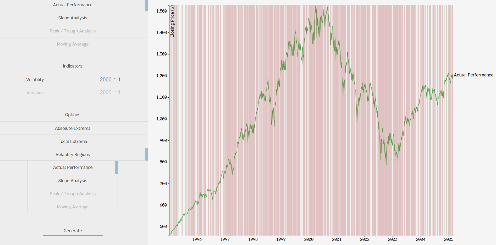
That was with .2% tolerance. Comparing that with the screenshot of our .5% graph, you can see one problem: everything is red. Theoretically, we could change the tolerance threshold around based on the timeframe, but finding a good metric to measure "correct volatility regions" by and then developing the algorithm to find the "best fit" for a tolerance value was too much for this project.
But wait! If you don't focus your eyes, you can see some groups of regions with the same color. This is when you say "oh, that makes sense." I suggest, then, that you can simply do another pass over the data again in a "smoothing" function that would look for these groups of regions and combine them into "more general" regions. The main problem with this approach is that it would make our observations more general; if the function did too much "smoothing" (sensitivity was too low), then a small block of high volatility may be swallowed up in green or vice versa. I like to think of it as "lossy volatility region compression algorithm."
Learning Points
While it was a smaller project, I had fun with it. I wanted to do some exploration with D3, and that's exactly what I did. I also learned a little about financial data and how to work with it. Here's the recap:
- 1. D3 is powerful AND fun
I could have used a simple plotting library to do this, but I wanted to take a stab at D3, since I worked with it for Project AbbCruncher and wanted to go a bit further. It's extremely powerful. I also found Mike Bostock's website both mesmerizing and extremely helpful in learning the library.
- 2. Financial data is wacky
It's understandable that rule-based quantitative finance algorithms were abandoned in favor of machine learning so quickly; making rules to predict something as chaotic as stock prices (remember, the S&P 500 is an index, so its price is generally more stable than individual stocks') seems impossible. The data is just too unwieldy.
- 3. Verano means "Summer" in Spanish
I gave Sean the liberty to name the project. I didn't realize this until after the summer.