Project AbbCruncher
"D3 is really weird" - everybody
My second project during my returning summer at AbbVie was, in my opinion, more fun. I worked with the competitive intelligence group, which ended up being a lot like internal business analytics. The VP of my department had a giant CSV file of interest relations (researcher x is "interested" in topic y) of every employee in R&D. The goal was to be able to visualize how the employees worked with each other and identify those who should be collaborating. The problem with using this file effectively was that it included thousands of employees across hundreds of locations and countries with millions of relations. You just can't get any useful information out of a file that big unless you get fancy.
What I ended up doing was designing, building, testing, documenting, and presenting a fully extensible visualization platform. What I mean by "visualization platform" is that I used D3 to produce very general graphs and charts that could fit multiple kinds of data with minimal adaption of the underlying code, with the first two graphs implemented being the ones needed to analyze how employees interact with each other. It was a big task and almost completely delegated to me, so I appreciated the responsibility and enjoyed the whole process.
Features
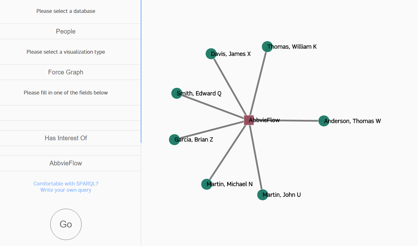
The platform was a one-page web app, with a side panel for the controls and the remainder of the screen for the visualization. You could choose which database to choose from, but the only option I developed for the proof of concept was the "People" database. You could also change the type of visualization, by default force graph, and then you could query the entity you'd like to know about. The rest of the options were pretty much cosmetic. Below is a video that covers the project's functionality, if you can handle my sick voice for 5 minutes:
Implementation
At the time, most applications at AbbVie were written using more traditional languages (think Java and C#). This project was meant to be more "modern," so it was built with almost exclusively Javascript. The front-end consisted of one HTML file, one CSS file, and a few Javascript files. The D3.js library was used for the visualizations, and it worked very well for our purposes. Force graphs have a unique approach, but are immensely useful.
The side panel was designed to be filled out step-by-step. First, the database needed to be specified. Since each visualization would display data differently depending on the kinds of data contained within the selected database, it made sense to ask the user for the source first. Next, the type of visualization was chosen. Knowing how the data was going to be displayed was required before asking for the entity. Finally, the user chose the database object to query. The idea behind having up to only three inputs lies in how we stored the data. Specifically, we used a graph database called Stardog. In a graph database, everything is stored as a "triple": "John loves Mary" or "Jack is a person." These relationships are powerful, and you can read all about RDF and why it's useful, but our motivation was to test if it would be an effective technology for drug discovery (I think it is). Because we had these triple relationships, we figured modeling our UI around it would be intuitive. With a little bit of input placeholder fairie dust, all is well.
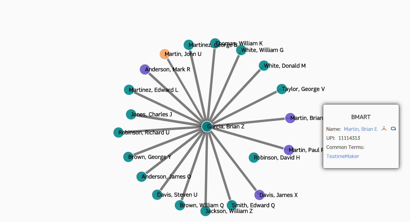
If you watched the video tutorial (around 3:50), you saw a quick demo of the edge confidence slider. For those who didn't just go back and look, it refines the data set by only displaying nodes above the selected edge confidence (which is more generally a measure of the "connectedness" of employees). This was done by reloading the graph every time the slider's value changed, which forced the force graph to check which employees were connected, purge any newly unconnected nodes, and add any newly connected nodes. Because D3 handles the transition between data sets for us, that was all that needed to be done.
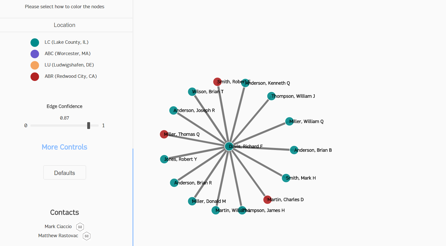
The other controls were all cosmetic; four of them (shown in the video at around 4:15) are built-in controls to D3's force graph layout, while the last one (node coloring) was heavily customized. We allowed the user to color the nodes by either the location of the employee (we have campuses all around the world) or the connection strength to the hub node. This simply involved telling D3 which attribute to look at for each node and assigning either a linear or ordinal color scheme.
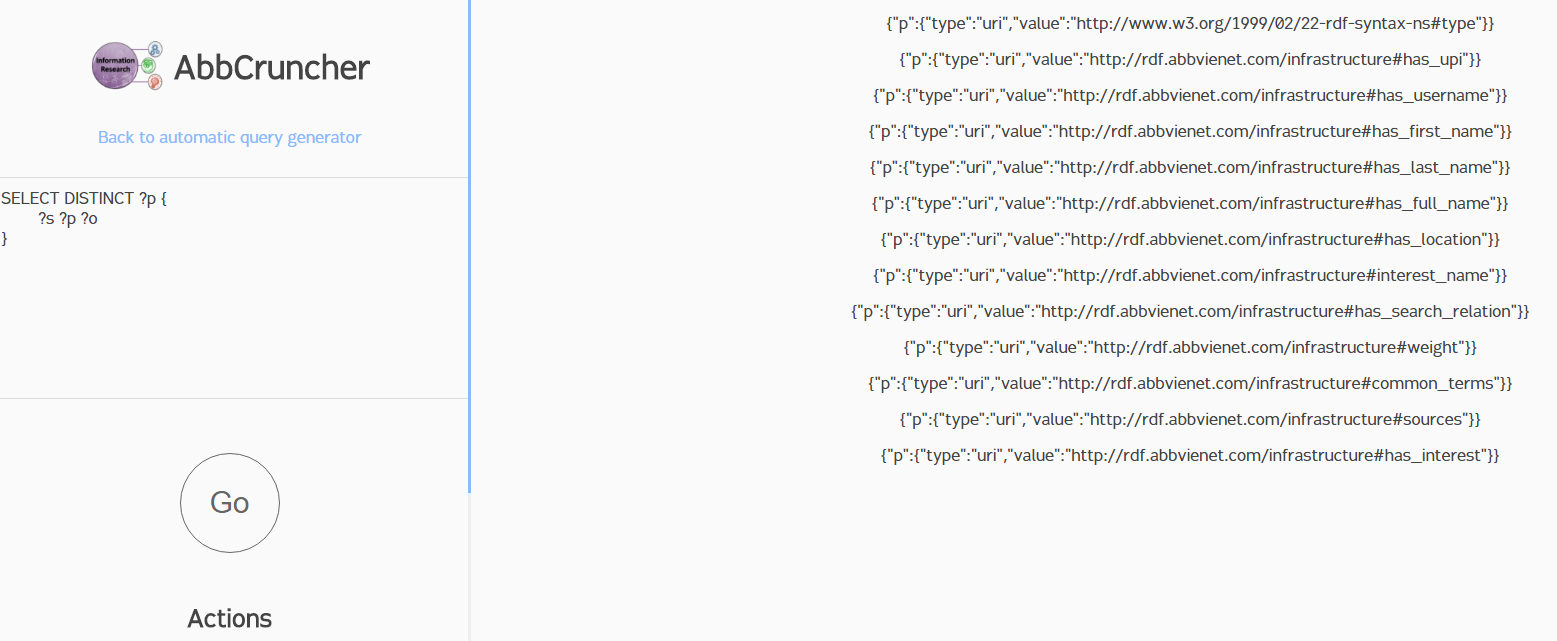
Since this was an internal tool, we decided to also add a manual query field. Since switching tabs is a lot of work, I allowed anyone to enter their own SPARQL (the de-facto graph database query language) query into the tool to see what results it returned. If you don't know SPARQL or RDF, the results may seem convoluted. The basic query shown in the screenshot below simply asks for every triple in the database (since we used variables - denoted by the "?" - for the subject, predicate, and object fields), but only grabs the predicate ("?p" at the top) to display. Essentially, we're asking the database to show every type of relation between two entities that exists. You can see on the right side of the results that this includes some characteristics of employees ("has_upifirst_name", "has_first_name", etc.) as well as some properties of the links between employees ("weight", "common terms", etc.). This allowed any curious employee (specifically, any of the three employees who knew SPARQL at AbbVie) to run their own queries and poke around with the data directly.
Learning Points
I learned a ton from the project, but it was mostly concentrated on the idea of graph databases. I also had some planning difficulties, and I had to refactor some of the code that was written for me. This still stands as one of my favorite projects of all time simply due to the sheer amount of new concepts I was exposed to.
- 1. Graph databases are COOL
Before this, I didn't even know graph databases existed. I suffered through the entire RDF spec and read the entire SPARQL fish-book, and I still feel like I've barely brushed the surface. The whole concept of the "Semantic Web" is fascinating, and I hope I can find time to dig into it further. I also enjoyed working with Stardog; it was one of the smoothest software packages I've run into, and full of rich tools. Along the road, I'd like to try out Neo4j or another graph database.
- 2. Plan out your UI
This is probably my third project chronologically where planning was classified as a learning point. While AbbCruncher was better, the codebase is still pretty messy. Especially the front-end UI. Beneath the fancy animations and sleek loading bar is a monstrosity; a tangled mess of conditionals and unnecessary functions that absorb the screams of the developers who witness it. With every tear shed for the violated UX principles, it grows more powerful.